2025
UX/UI Designer
Figma, Figma Make
Midjourney (visual exploration)
Gamma (presentation layout)
Adobe After Effects
Adobe Photoshop
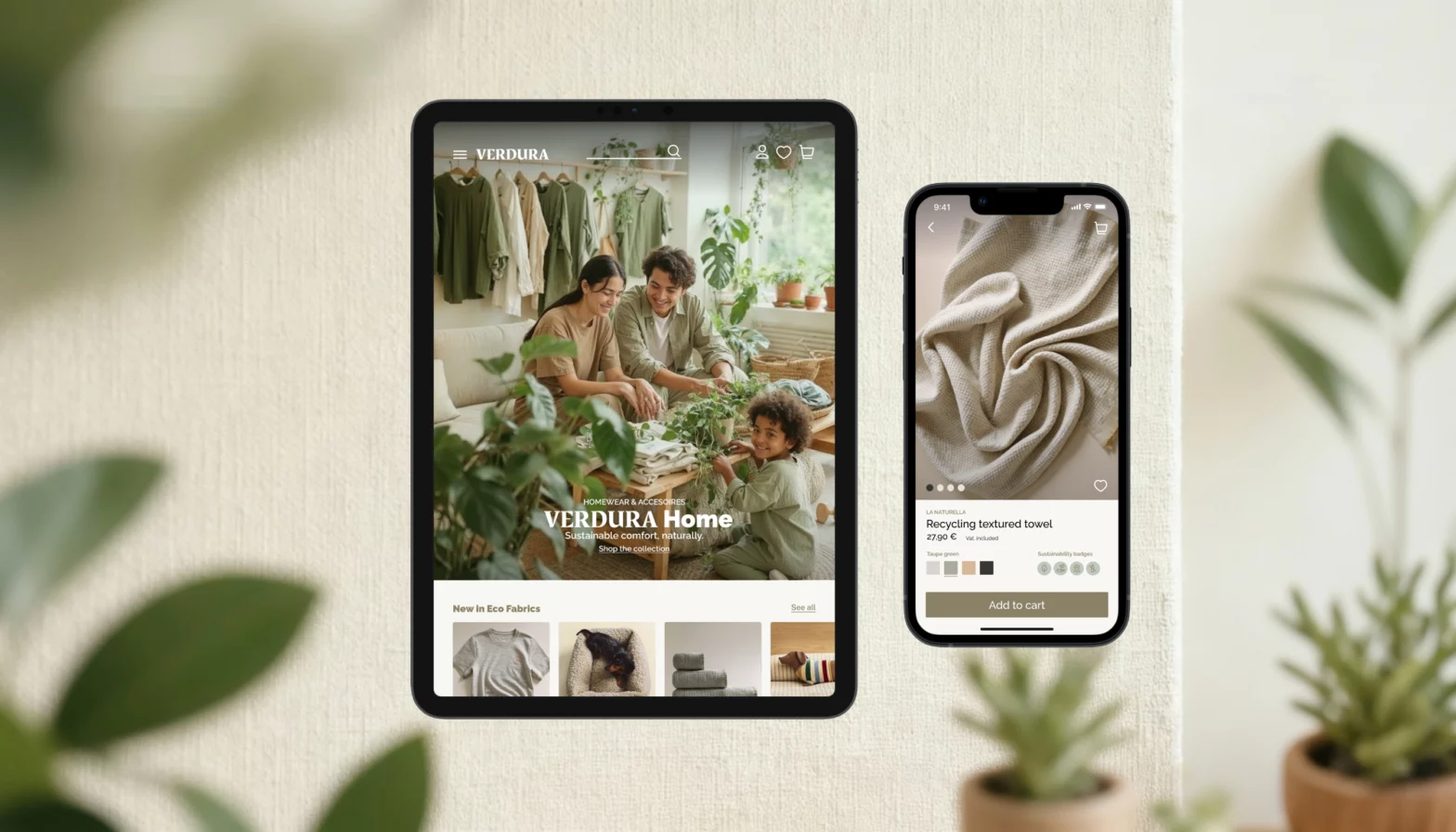
A mobile-first e-commerce concept focused on transparency, sustainability, and a smoother shopping flow. Designed end-to-end, from research and structure to high-fidelity screens for mobile and tablet.
Verdura is a concept platform aimed at helping users shop for environmentally conscious products. The goal was to design an experience that feels simple, trustworthy, and visually calm, while emphasizing sustainability without overwhelming the user.
The project includes research, information architecture, wireframes, and a full high-fidelity design system.
Cognizant
The Challenge
Design a mobile-first shopping experience that makes sustainable products easy to understand and even easier to buy. The goal was to reduce noise, build trust, and streamline the journey without losing clarity or conversion.
- Building Trust
Clear eco-badges, simple sustainability explanations, and an impact tracker to avoid greenwashing.
- Improving Usability
A lighter structure with intuitive navigation, focused filters, and quick access to actions like Add to Cart.
- Supporting Conversion
Transparent pricing, delivery details, and a fast checkout flow (Blik Payments- adjusted to the polish market) to keep momentum.
- Responsive & Scalable
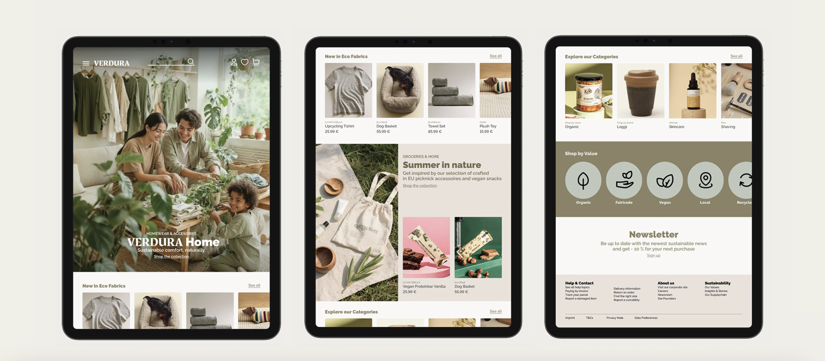
A system that adapts smoothly across devices using flexible grids and consistent components.
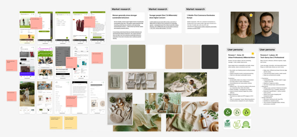
Research & Insights
A mix of market research, competitor analysis, and user profiling shaped the direction of the product and clarified where sustainable shopping breaks down today.
- Market research
Identified mobile as the primary shopping channel and found two key groups driving eco-purchases: women 30–44 and younger users seeking measurable impact.
- Competitor analysis
Reviewed leading platforms (Zalando, Westwing, Avocadostore) and found strong UX patterns but unclear, inconsistent sustainability labeling.
- User insights
Defined two personas, one trust-driven, one impact-driven, highlighting the need for clearer eco-information and less cognitive load.
- Visual direction
Explored calm color palettes, textures, and simple layouts to support transparency and reduce decision fatigue.
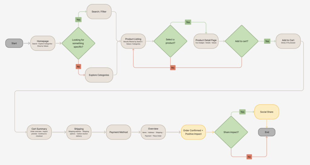
Design Process
The design process started by shaping a simple structure for browsing and comparing eco-products. Early wireframes helped define hierarchy and reduce cognitive load across homepage, listing, and product pages. From there, I explored a calm visual direction using soft colors, natural textures, and clear eco-badges to support trust and usability. The moodboard set the tone for neutrality and warmth.
Final UI Screens
The final interface brings together structure, clarity, and sustainability cues in a simple and modern visual language. Each screen is designed to reduce cognitive load and help users make confident, values-aligned purchase decisions.
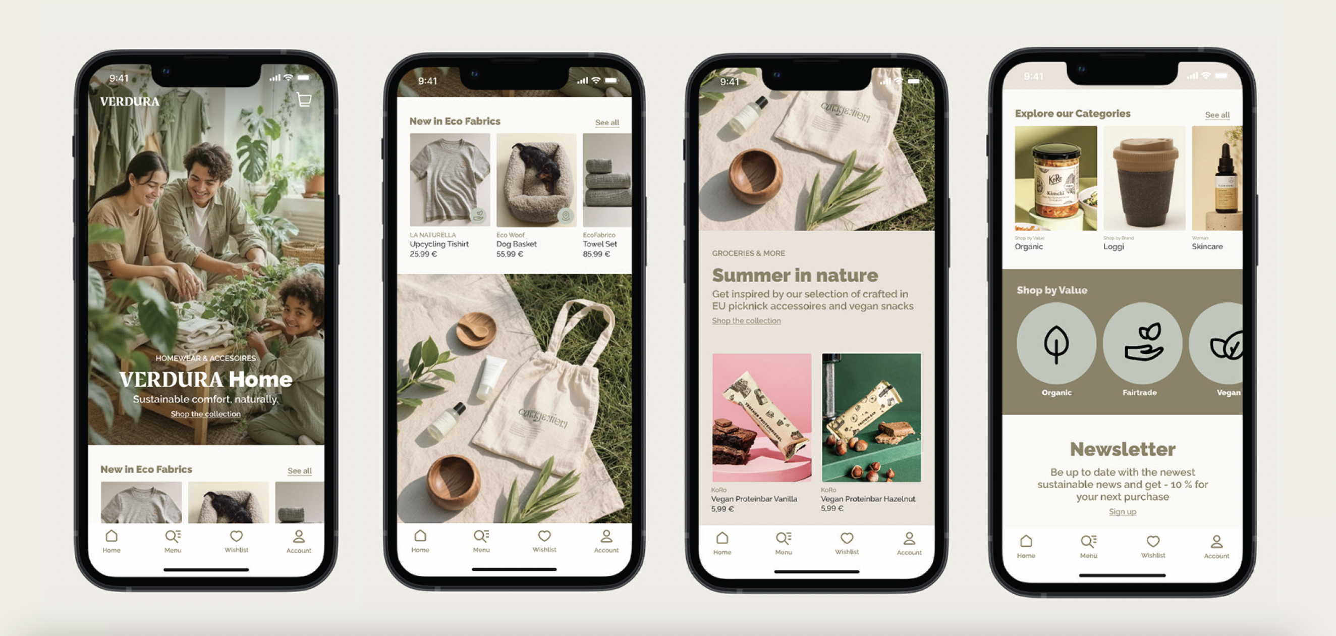
Homepage
The homepage introduces the brand with seasonal eco-campaigns and quick entry points into categories and values. Layout and spacing support a calm and inviting first impression.
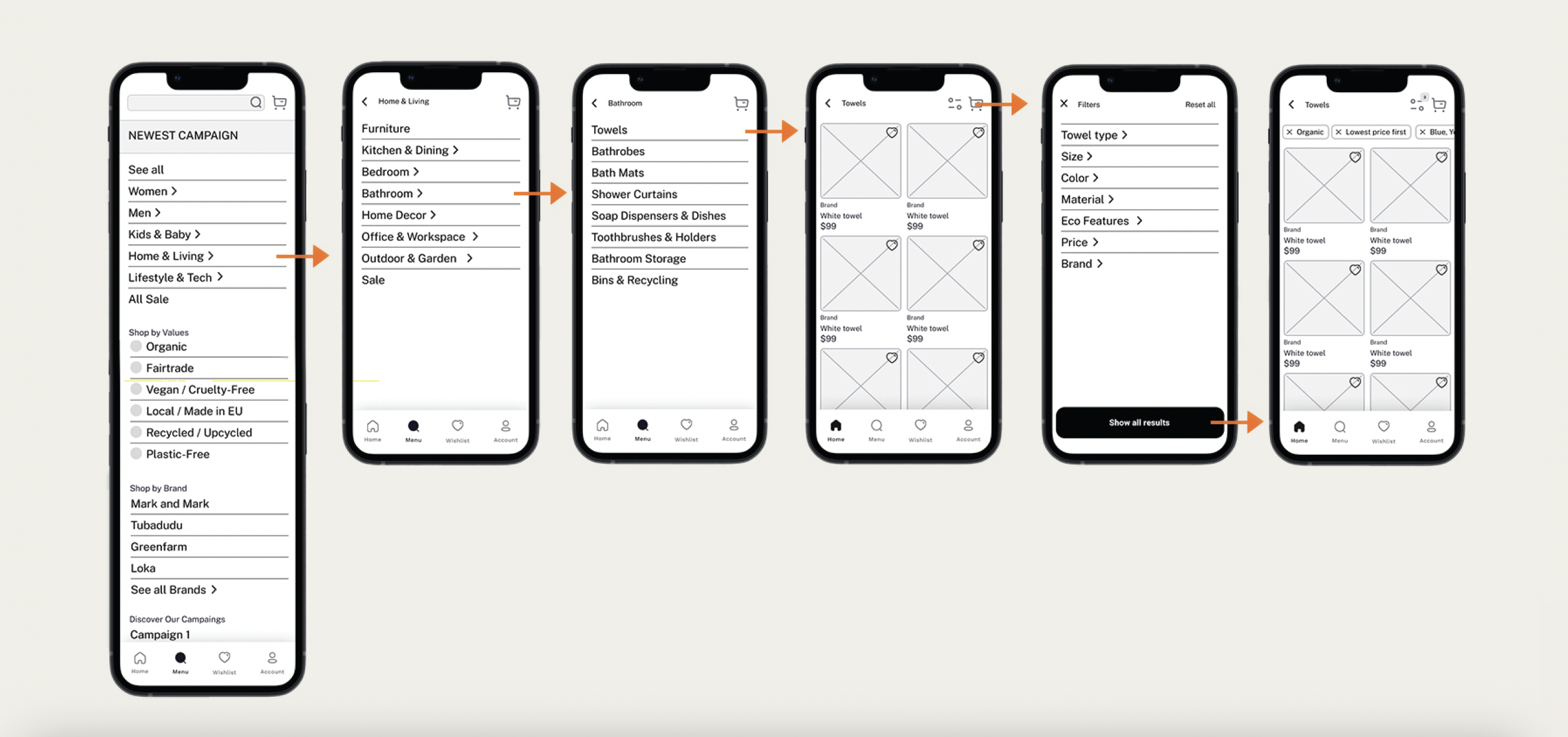
Product Listing
The listing page makes it easy to browse, filter, and compare products. Value-based filters help users discover items that match their preferences, while clear cards keep the focus on quality and sustainability.
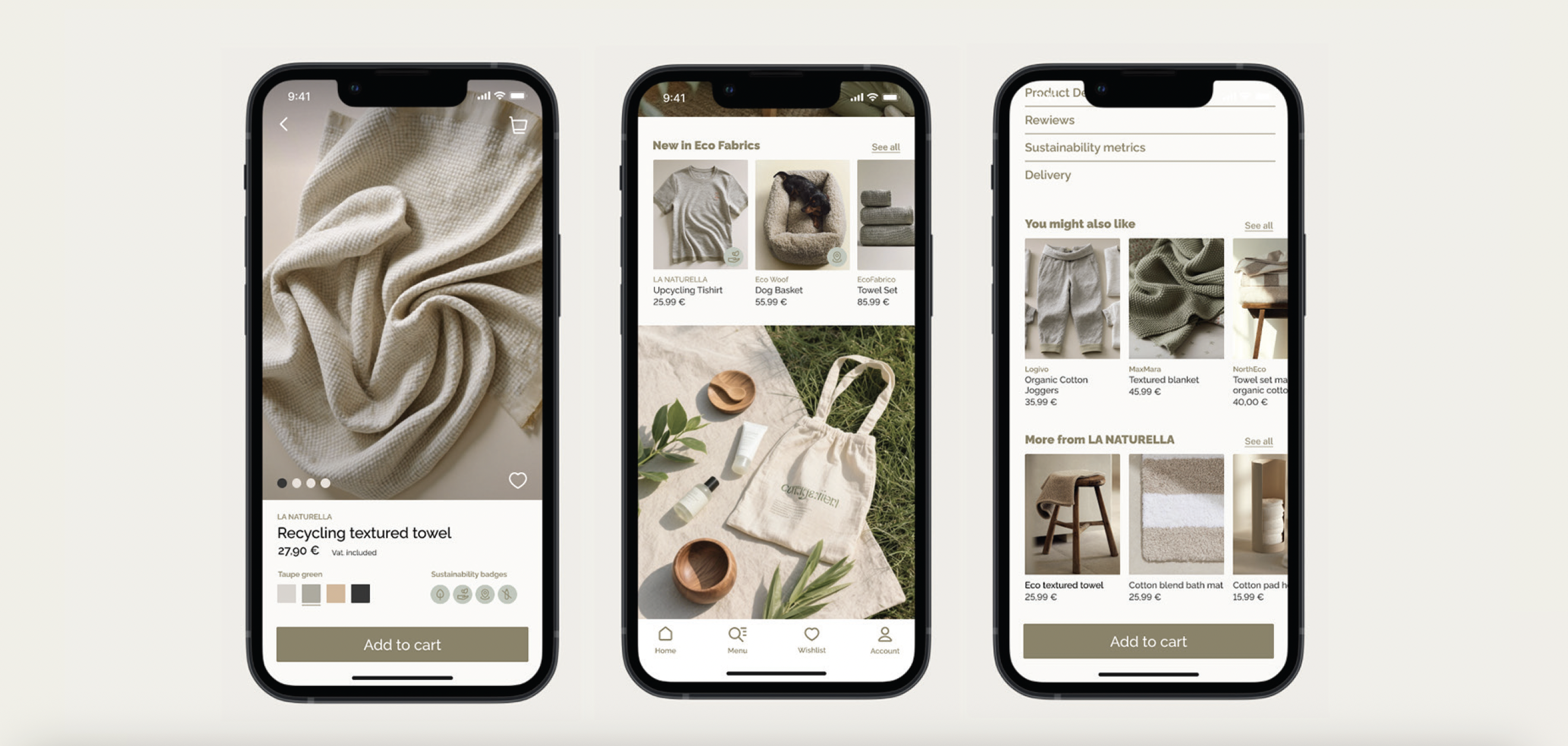
Product Detail Page
The product page uses large imagery, structured content, and sustainability metrics to build trust. Eco-badges, materials, impact information, and clear purchase actions support transparency.
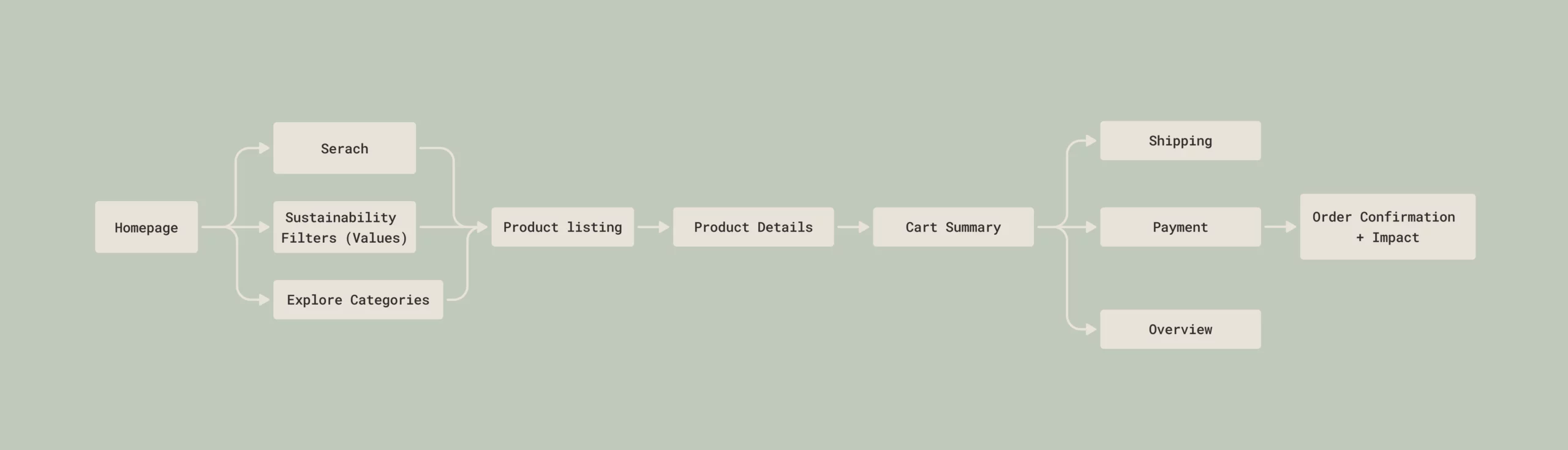
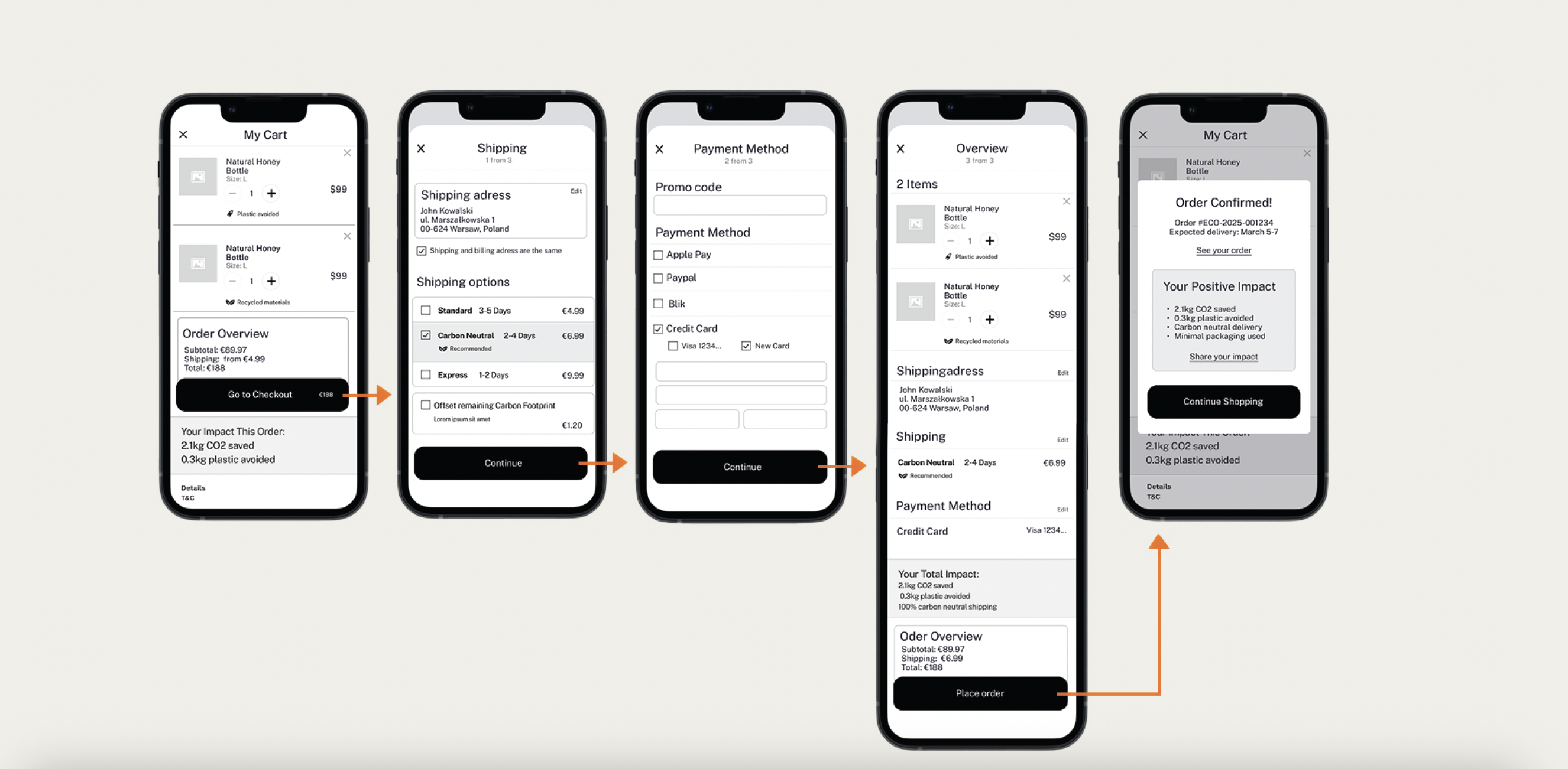
Checkout
The checkout flow is clean and predictable: Cart, Shipping, Payment, Review, and Confirmation. Sustainability impact is highlighted throughout to motivate purchase and reinforce the brand’s purpose.
Homepage
Product Detail Page
Product Listing
Product Checkout
Outcome & Learnings
Verdura delivers a simple and trustworthy eco-commerce experience that helps users make conscious purchase decisions without feeling overwhelmed. Clear structure, value-based filters, and transparent sustainability information create a calm and intuitive flow from browsing to checkout.
The project also shaped how I think about impact and transparency in product design. Translating complex sustainability data into clear, approachable UI elements pushed me to balance usability, clarity, and visual warmth. It reinforced how thoughtful structure, from navigation to checkout, can make sustainable shopping feel natural rather than demanding.