2024–2025
(7 months)
Brand, UI/UX &
Web Designer
Figma, Illustrator, Illustrator Beta, InDesign, PowerPoint, Canva, Google Docs, Midjourney, Claude.ai
Logivalue is a company specializing in logistics infrastructure and e-commerce fulfillment solutions.
They needed a website and visual identity that would express their expertise while feeling approachable and modern.
I designed their entire digital and visual presence: starting with the logo and color palette, and extending into a new UX-driven website experience.
The result is a consistent, human-centered brand that makes complex logistics easy to understand and engaging to explore.
Logivalue
Visual identity system
Website design
UX copywriting
Marketing materials

The Challenge
Logivalue wanted to strengthen their online presence and present their offer in a clear, confident, and modern way.
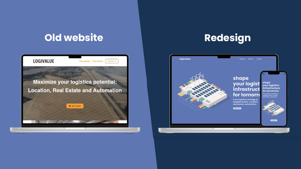
Their earlier website didn’t fully reflect their professionalism or innovation, and their brand lacked cohesion.
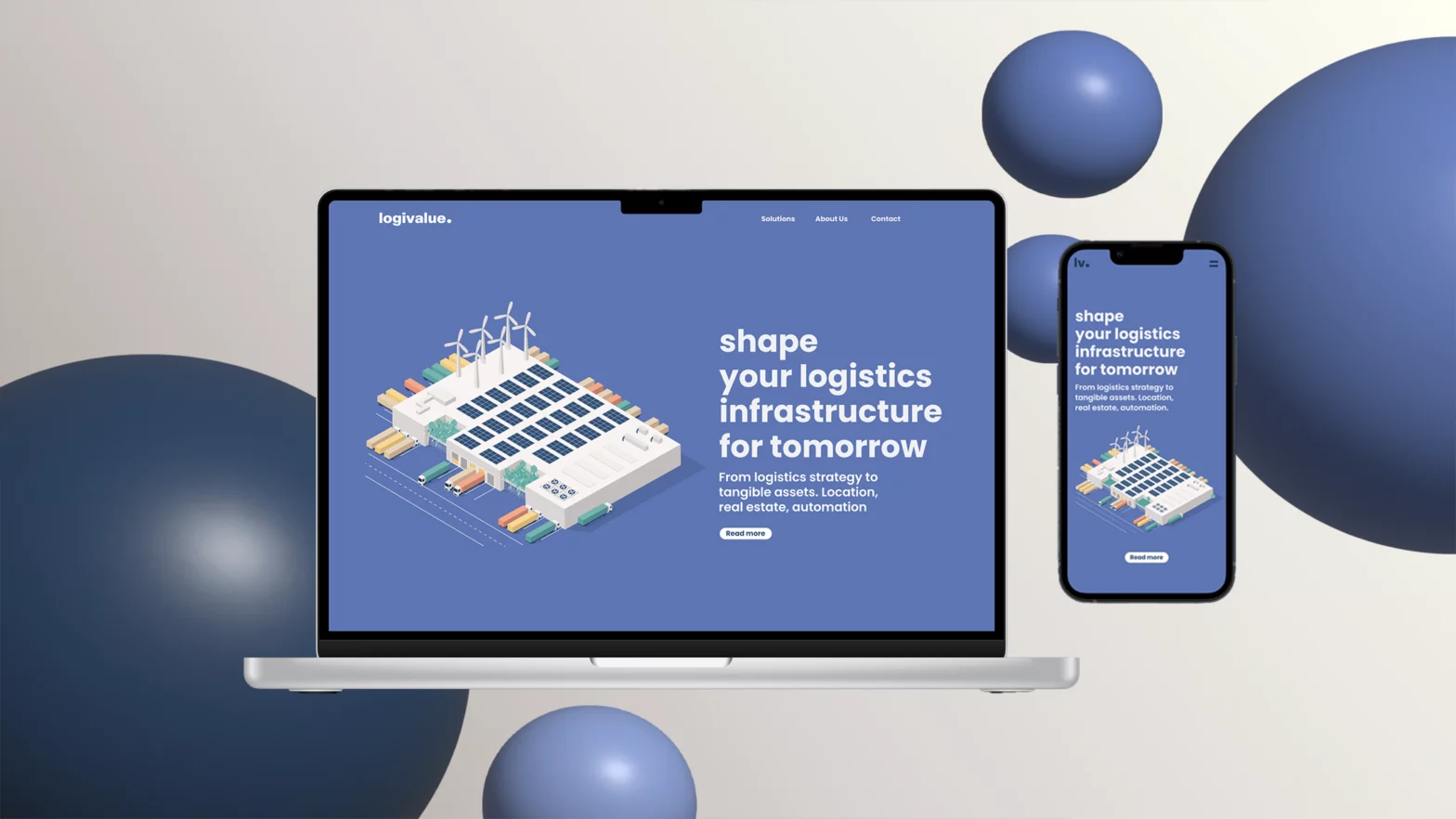
The goal was to design a new website optimized for both desktop and mobile, supported by a full identity system.
Together, these would communicate trust and make it easier for potential clients to understand Logivalue’s offer.
Research & Insights
The process began with conversations with the founders to understand their vision, target audience, and growth goals.
Most clients already knew Logivalue personally, so the digital experience needed to build trust while staying inviting for new visitors.
Through competitor research, I noticed a pattern: logistics brands often leaned on heavy text and corporate visuals.
I wanted to do the opposite – making the experience simple, open, and visually light, using warmth and motion to set them apart.
I restructured the content for clarity and exploration:
- An About Us page to introduce the team and company story.
- A Solutions section to make the offer easy to navigate.
- Streamlined, SEO-friendly copy that communicates value quickly and clearly.
Design Process
I began with low-fidelity wireframes to validate structure and content hierarchy. Once approved, I developed high-fidelity layouts in Figma, guided by the dot from the new logo — symbolizing circularity, precision, and connection.
Circular motifs and rounded shapes became central to the design language. Interactive bubble animations and soft transitions add energy while maintaining professionalism. The design was optimized for responsiveness, ensuring smooth performance and readability across devices.
All UX copy was written and iterated in Google Docs, balancing accessibility, clarity, and SEO optimization.
Visual Identity
Alongside the website, I created a full brand identity system to keep communication consistent across platforms:
- Logo design inspired by circular flow and precision
- Color palette combining trust and approachability
- Typography system for digital and print readability
- Business cards, letterhead, presentation templates, and Canva assets
- Brand book built in InDesign
- LinkedIn visuals and video call backgrounds for digital touchpoints
Every piece connects through rounded forms and circular accents – a reflection of Logivalue’s focus on continuity and collaboration.
Outcome
The final result is a brand and website that feel cohesive, professional, and personal.
The new responsive design communicates expertise without overwhelming the user, working seamlessly across mobile, tablet, and desktop.
After launch, website visits increased, and clients described the experience as clear, trustworthy, and easy to navigate.
The visual identity became a daily tool for the team, used in presentations, proposals, and online communication, giving Logivalue a consistent, confident presence.
Reflections
This project taught me how to connect visual storytelling, usability, and brand identity in one coherent experience.
Designing everything from the logo to the responsive website made it possible to control every detail of how the brand communicates.
It showed me how even complex, technical industries can look and feel human, approachable, and elegant when design puts clarity first.
