2025
- 3,5 months
- UX Research, Wireframing,
- Prototyping,
- Usability Testing,
- UI Design
- Accessibility & Inclusivity
- AI-Supported Workflow
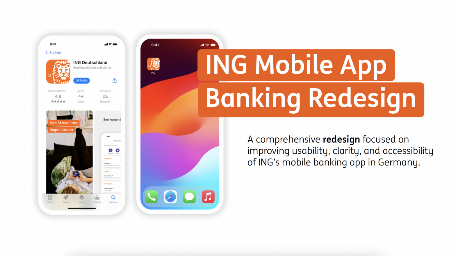
This case study presents my redesign of ING’s mobile banking app in Germany. Based on user research, surveys, and app store reviews, I uncovered key frustrations: confusing navigation, no built-in budgeting, and lack of English support. My redesign introduces a clearer tab structure, integrated budgeting and spending categorization, and a language toggle, making the app more intuitive for everyday users and more competitive in the fintech landscape.
UX/UI Designer (solo project, bootcamp capstone)
- Figma & Figma Make,
- Adobe Illustrator &
- After Effects,
Freepik AI, - Gamma AI,
- ChatGPT & Claude.ai,
- Fireflies.ai
The Challenge
ING’s mobile app was widely used in Germany, but reviews and interviews revealed a pattern of frustration. Users struggled with unclear navigation, had no way to budget or track spending, and international customers were blocked by the lack of an English option.
Beyond user pain, these issues also carried business risks: customers turned to external tools like Excel or competing apps such as N26 and Revolut. Without addressing usability and accessibility gaps, ING risked losing relevance among digital-first users.
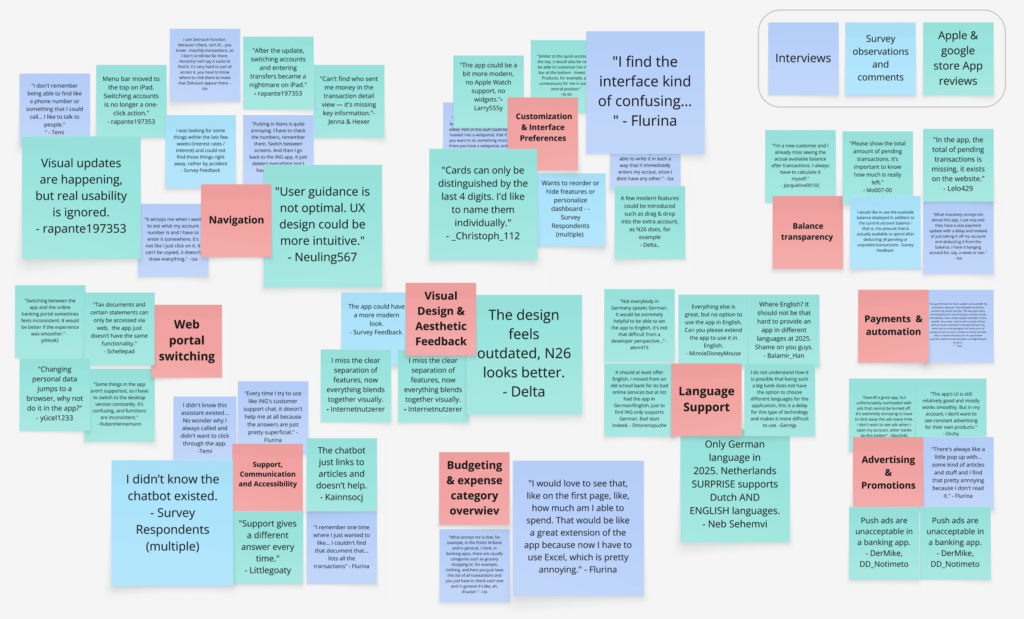
Research & Insights
To ground the redesign in real user needs, I combined App Store reviews (100+ analyzed), a survey (17 responses), and in-depth interviews (3 participants). Patterns quickly emerged:
- Navigation was confusing
Key features like transfers or account switching were hard to find.
- Unclear Overview of Spendings & Budget
Users tracked expenses in external apps or Excel because the ING app lacked budgeting tools. Many struggled recognizing transactions due to lack of proper labeling.
- Language Barrier
International users felt excluded: no English language option made everyday banking difficult.
I translated these findings into personas to highlight different needs:
- Zoe
A young digital native expecting a modern, customizable interface.
- Lauren
A budget-conscious expat relying on English support.
- Thomas
A long-term saver needing simplicity and trust.

Zoe
Digital Native
- Daily app user for quick transactions.
- Never used an online portal.
- Expects modern, intuitive experience.
- Frustrated by slow updates and outdated interface.
- Tech-savvy, uses multiple finance apps.

Lauren
The Budget-Conscious Expact
- Wants simple UI, real-time balance, easy access to core features.
- Compares to global banking standards.
- Needs accessible customer support.
- English speaker struggling with German interface.

Thomas
Thoughtful Saver
- Uses the app mainly for balance checks and savings, regularly switches to portal.
- Long-time ING user, hesitant to switch banks despite ethical concerns.
- Ignores complex features.
- Prefers real people over chat or bots.
Design & Iteration
Starting with low-fidelity wireframes, I tested early ideas for navigation and budgeting. These quick sketches helped visualize a new tab structure and explore how a budgeting feature might fit into the app.
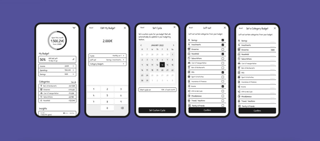
Usability testing revealed critical issues:
- Users didn’t realize multiple accounts were hidden by scrolling → solved with account cards.
- Budgeting cycles (monthly vs. yearly) caused confusion → redesigned into a simpler overview.
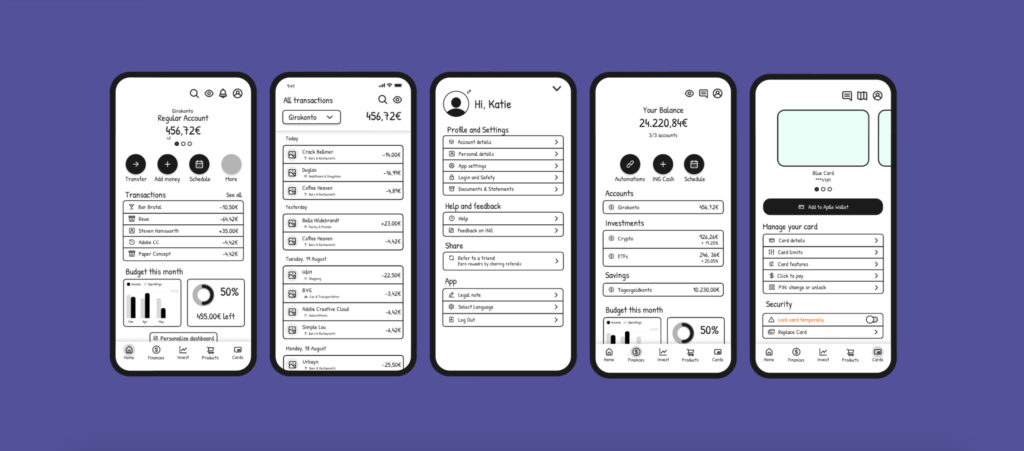
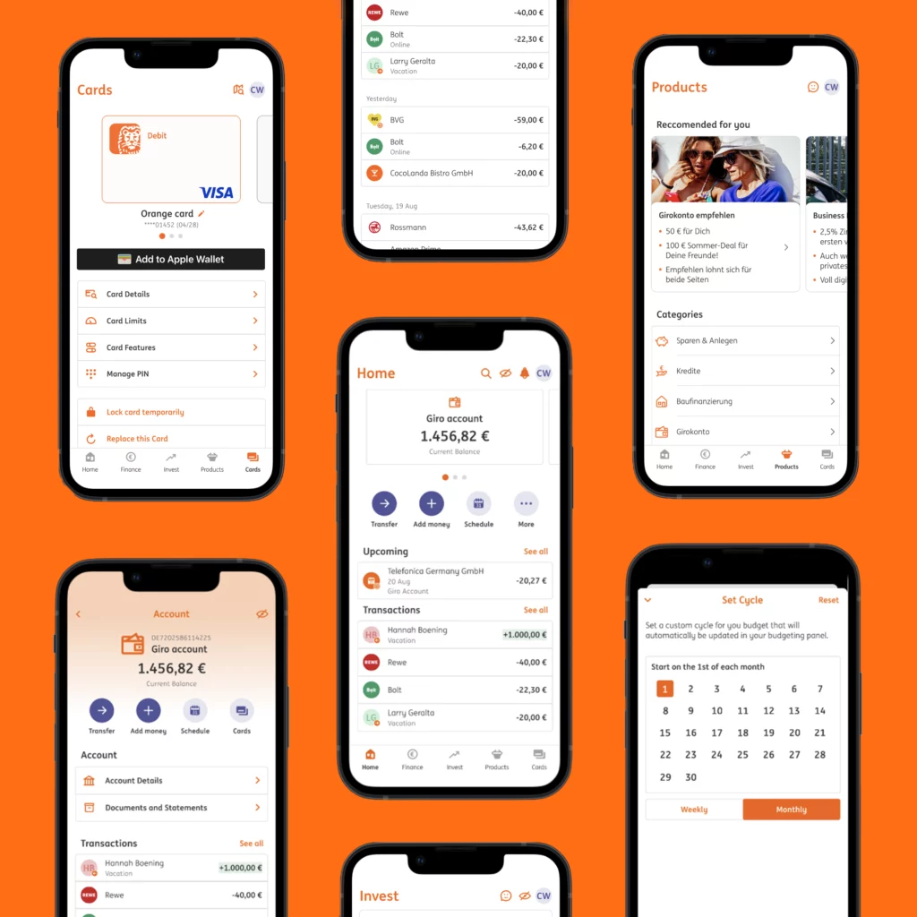
Each round of testing informed the next iteration. The final hi-fidelity prototype reflects these learnings: a clear navigation system, visible accounts, and an integrated budgeting experience.
The New ING Experience
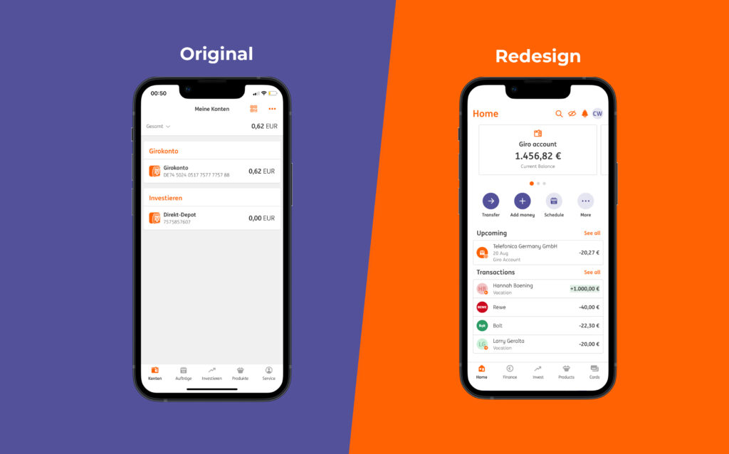
The redesigned ING app delivers a clearer, more intuitive experience by restructuring navigation, making accounts easier to access, and adding features that support both everyday users and international customers.
🔄 Navigation → Simplified into four clear tabs: Home, Finance, Budget, and Cards.
💳 Accounts → Displayed as cards, eliminating scrolling confusion.
📊 Budgeting → Built-in categorization and spending overviews keep users in control.
🌍 Accessibility → English/German toggle opens the app to expats and non-German speakers.
Impact & Business Value
The redesign not only improves usability but also creates clear value for both users and the business. By clarifying navigation and adding budgeting and language features, ING can strengthen retention, reduce support costs, and attract a broader customer base.
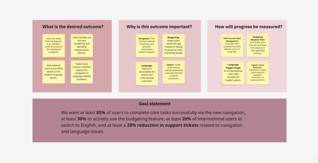
User Impact → Simpler navigation and built-in budgeting reduce frustration and keep users engaged within the app.
Business Impact → Clearer structure and self-service tools lower support tickets and operational costs.
Growth Potential → English/German toggle expands accessibility and competitiveness in the fintech market.
Wrap-Up & Prototype
This redesign shows how thoughtful research and design decisions can transform a banking experience from frustrating to effortless. It combines usability, accessibility, and business impact—balancing what users need with what helps ING grow.
Explore the full interactive prototype in Figma →